Spring Forward with bloom: New Booking Pages are Almost Here!
(Now with an optional Monthly Four Week view so you can see more dates on one page)
More visibility, more control, fewer clicks…
In the days ahead, you may notice that your freetobook diary looks a little different. It’s part of our ongoing work to upgrade the technology behind our platform. We have to do this to make sure it doesn’t slow us down over time. In the same way, you need to upgrade your phone every few years, we also need to keep freetobook up to date so we can continue to build the features that you need for the greater success of your accommodation business.
The functionality of your freetobook diary will increase with these changes and while the tweaks to the design may take some getting used to, they will benefit you. The new diary version is designed to give you a consistent experience across freetobook, whilst also improving speed and accessibility.
Here’s an overview of the changes you can expect to see in your diary.
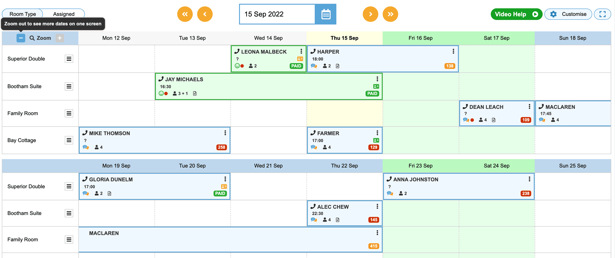
In short the new diary surfaces more information making it easier to manage bookings with fewer clicks; we now show more key information so it’s available at a glance and this has been achieved by increasing the space given to each booking in the diary.
Zoom in and out to show more or less booking information. Showing less booking information results in more bookings on the screen. Zoom in and out for the best of both worlds.
Customise, save and edit settings so the diary fits your preferences.
Monthly vs. Daily (two views) – choose which suits you better. We think properties with fewer than 10 units will likely prefer the monthly view.
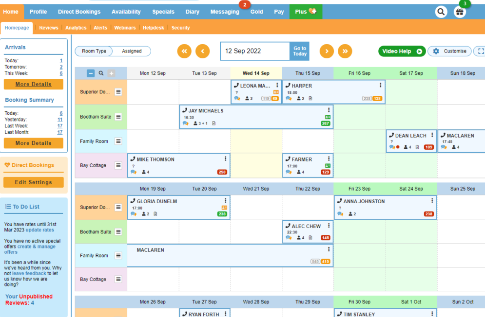
Here are some clickable images of what your new diary page will look like in Monthly view for 4 units.
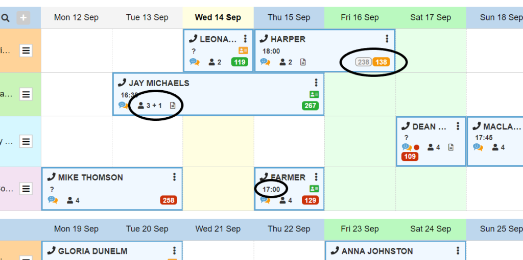
The new dairy increases what you can see and do on each booking with a single click by displaying payments, arrival time, notes, booking source logos and occupancy as well as single click access to messages.
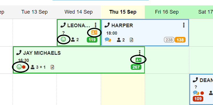
It also displays Digital Registration status and Smiley Survey results (both part of Messaging). This makes is super easy to see which bookings have replied a message and which have completed their digital registration
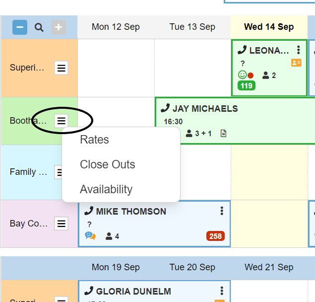
Your rates, availability and close out management can now be managed within the diary page itself providing more control from the diary. These are accessed via the “hamburger” menu next to the room/unit name.
Other benefits are highlighting event dates/weekends, adding notes on close outs plus more customisation on the visuals (selecting your unit colours).
The Monthly diary keeps all the above but with more dates visible (i.e. 4 weeks) – it’s ideal for properties with 1 to 5 units but the Zoom In/Out option makes it attractive for even larger properties.
With all this at your fingertips booking management becomes easier and faster.
We removed the old ‘Add Booking’ button as it is no longer needed and we taking up valuable space, simply click on any available date in the diary to add a booking on that date for that unit!
Some feedback….
“Yay!! Thank you, thank you, thank you, it’s great. I especially like it’s on the Home Screen in full month now too. I have migrated fully now as I love my month view too much.“
“We are definite 100% converts to the new format!“
“Absolutely love the new diary, it’s been very frustrating not to see a month a time, it is so much better. Great job!“
“ It is brilliant and just what we were looking for! “
Take a look at your New Diary click here..
In the short video (2mins) below Eleanor shows the key features of your new diary…