Spring Forward with bloom: New Booking Pages are Almost Here!
A glimpse into booking page re-design on freetobook.

To take advantage of the latest technologies, new browsers and devices it is critical to keep updating our online processes along with the latest look and feel. It never really stands still so neither do we. (Sneak secret demo sample at the end of this blog)
With this in mind we are currently creating new booking pages, updating them to be the best in their class. Some of you might be interested in the concepts and considerations we have as we work through building better booking pages. Don’t worry, this is not about computer code it’s about design principles that we can all grasp.
There are some fundamental rules about how we interact with processes and probably the most important one is the length of process.

It is a law that the longer any process is, the less likely it will be completed. To extend the metaphor, we are looking for a sprint not a marathon. This is just as true of a marathon as it is filling in a tax return, or in our case making a booking. The shorter the process the greater the number of completions. A shorter booking process has less to fill in or click and naturally results in more completed bookings.
Browsers and devices are helping, with autocomplete now standard on most. You may already be familiar with your email, name and phone number being auto completed on your phone or regular desktop browser. Google’s Chrome browser has an option to translate pages to your language making it easier to book anywhere in any language.
In the online world the length of a process contributes to what is known as “friction”. Think of friction as a bad thing that slows you down and can stop you dead in your tracks. We want to reduce any barriers by making the process faster and more pleasurable to complete, with minimum distractions.
A good starting point is to make the most common booking into the easiest booking possible with the fewest clicks. We use the most likely booking request and create the design on that basis. It’s not a trivial consideration because whilst we know the most likely search we must also accommodate all possibilities. We need to make properties that don’t have availability attractive to book.
Our next key concern is to make sure that we are showing the best availability to fit what the guest is looking for. Here we’re helping the guest filter or order your availability according to their requirements. This is very different from simply showing all availability all of the time which is tempting and easier to do but can be very distracting and confusing, leading guests to drop out. Distraction and confusion are other key types of friction.

Having built the process to fit the most popular searches even when they are not available, we then have to consider rarer events, more edge cases, like booking several units at a time. The vast majority of bookings are for one room or one unit. In every case the process itself must be intuitive, attractive and balanced to the eye which further reduces our enemy friction.
Guests booking also need to be “wowed” by your offering and informed enough to make the right decision, without being overwhelmed or confused by information. Your branding and images must be capable of making the process shine without getting in the way of the process itself. All of us are easily distracted animals, distractions during the booking process impact our concentration and must only be used where totally necessary otherwise there’s potential for drop out.
We have to be sensitive to this when displaying offers or handling minimum stays, board basis and occupancy, it’s a fine line. Many properties want a great way to offer a room only and breakfast rate so this will be easier for the guest in the re-design. In all cases we need to make your availability easy to book, minimise friction to maximise bookings.
Going back to the length of the booking process. Ask yourself what is better – having perfect information about guests or having more bookings? Is some guest information a nice to have but really not essential? Take a question like “How did you find out about us?”, or even “What is your ETA?” Adding in these questions increases the booking process duration significantly and adds to friction.
Whilst this information may be important it is probably better to capture it after the guest has booked. Many of our customers use Messaging to capture additional information once the booking is completed. A guest is more likely to give an accurate ETA a week before arrival rather than when the booking is made. There’s even more friction when guests genuinely don’t have answers to your questions.
There is also no room for personal taste. We all have a preferred way to do things but the data needs to tell us which process is best. It’s a numbers game where we measure and analyse to ensure that the best booking process is the one we continue to implement.
We have just scratched the surface here, there are many other things to consider as we build the new booking pages into the best available for your business.
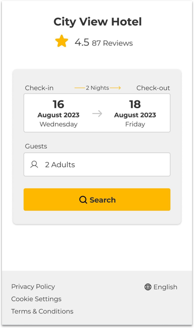
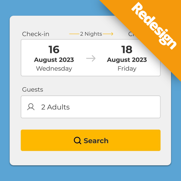
The design below is necessarily limited (it’s one example), so it is a flavour of what’s to come!
Click the image to try our interactive demo in your browser!